Friday, November 11, 2011

This is why I love working with brides...

I recently worked on a lovely project with CopperDog Press.  The bride wanted white on navy for both her invitation and envelopes.  I LOVE working with navy.  To me, it's my basic black.  And I LOVE working with white ink on envelopes.  To me, it always looks prettier.  It was so fun to get pictures from the bride throughout the process.  Here are a couple she sent me.


Didn't Donna at Copper Dog Press do an amazing job with the invites?!  I really enjoyed creating the calligraphy design for this invite.

 Note to self: I love how she packages the final product.  Twine with a little tag with her logo on it.


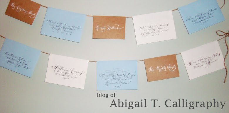
Here was one shot from the envelope addressing.


Rebecca sent me some shots of her diy part.  She lined the envelopes with beautiful paper to get it an elegant touch of color.


Love the stamps!  The fit perfectly with all of her colors!


Thanks Rebecca and Donna for including me on this project!

Thursday, August 18, 2011

Jazzing up the Black and White

I typically don't dig plain black and white invitations.  One, when I think of weddings, I automatically think of soft, romantic colors.  But also I think about what people are going to think when they open up their mail and see the invitation.  Black and white doesn't seem like anything too terribly different than Jack and Jill's invite from last year.

But I recently worked with the wonderful Kristen from Five Dot Design and seeing the final product convinced me that black and white can definitely stand out if done well.

Isn't it pretty?!  Very simple but with a "BAM" pouch for all the inserts.


Up close on the names.  The bride and groom names are definitely my favorite part to pen.  I'm pretty proud of this invitation suite.  First time using a new image edit process and first official invitation use of Ornamental Penmanship.